About · Logo
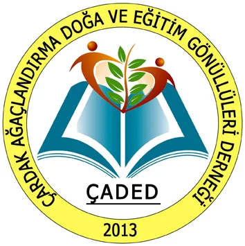
A book, a sapling, two people.
In October 2013 eighteen candidates went to a vote; more than two hundred townsfolk each picked three. This one won — its ring was yellow at the time.
What it says
A voter's note, as written:
"The book is in front — it says education matters. The leaf and branch look like an olive branch; green and peace at once. The figures around the branch seem to hold feet rather than hands — never mind, they still say unity and solidarity. And together they make a heart."Ballot comment by K.Y.Z.Ç., October 2013
The ring carries the association's full name; below it, the founding year 2013.
Eighteen candidates
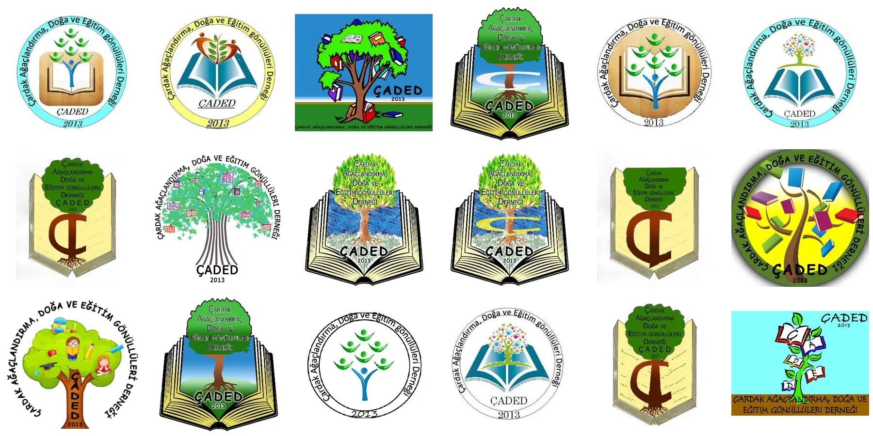
The vote stayed open for a month and drew over 200 ballots. Number 2 took 38%; no rival passed 20%. In the final version the ring was changed to green; the orange of the figures and the blue of the book were kept.
Logo vote (October 2013 letter + 18 candidates, Turkish)Colours
This site's colours come from here: green grounds and rules, blue labels and links, one orange button.
Colour variants
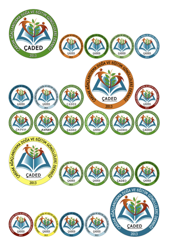
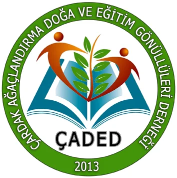
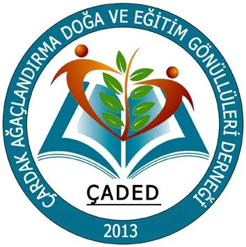
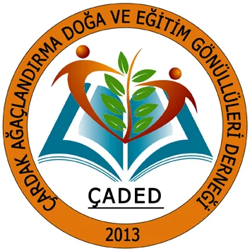
Seven ring colours were tried in 2013. Green was chosen; the others are archived. On a ground where green does not read — an event poster, say — the dark green or blue variant may be used; orange and yellow are for accent only.
Download and use
ÇADED logo, 800×800 px, transparent background (PNG). For press, event posters, partner associations and supporters. Keep the proportions, don't crop the ring, don't recolour; leave clear space around it of at least a tenth of the ring's width. A print-quality vector file is not on the site yet; download the PNG for the web.